CLIENT | DESIGN FOR AMERICA
Rebuilding nonprofit site to improve audience engagement and brand identity



PROBLEM STATEMENT
How might we redesign the SIS website to better communicate their brand and promote their services/events?
Project Overview
As part of the To Be Designed program created by Design for America at UC San Diego, our team partnered with Sustainability is Sexy, a San Diego-based, volunteer-driven environmental nonprofit dedicated to inspiring connection, education, and tangible solutions to the climate crisis.
Our goal was to redesign the website to be more engaging, informative, and aligned with the brand's vibrant, community-driven identity.
CLIENT
Sustainability is Sexy
UX /UI + Web Designer
Podcast + Donation
5 Designers
2 Stakeholders
Figma, Squarespace (HTML+CSS)
16 weeks
April - July 2025
MY ROLE
TEAM
TIMELINE
TOOLS


Thank you to the DFA team, and to Liz and Gabrielle from Sustainability is Sexy for entrusting us with your site! ❤︎
Impact
Following the redesign, Sustainability is Sexy’s website experienced a 44% increase in site traffic, indicating stronger user interest and improved discoverability! The updated structure, clearer calls to action, and more engaging visual identity helped attract and retain visitors. Overall, the site better supports the organization’s goals of growing its community and promoting climate action.
Reflection
This project taught me the importance of clear communication and collaboration, especially when aligning design decisions with the SIS team’s mission to make sustainability approachable and engaging. I learned to stay adaptable when translating our high-fidelity prototypes into Squarespace, refining layouts and interactions to suit the platform’s limitations. Most importantly, I saw how intentional choices like stronger calls to action, consistent branding, and lively visuals can make a website feel more inviting and authentic to its community.
Gathering insights
We surveyed Sustainability is Sexy (SIS) members and website users, and conducted a competitive analysis of five environmental organizations to identify opportunities for improved communication and engagement.
Clearer Brand Expression:
Users wanted visuals and content that better represent SIS’s mission and identity.
Stakeholder Needs
Our clients aimed to revamp the donation page and highlight reports, podcasts, and events to be more prominent and engaging. In addition, they wanted to update their services and educational initiatives, and overall, transition into a more dynamic, interactive site. They wanted to keep their current design system.
Our clients main audience targets event organizers, sustainability-focused businesses, and general public interested in eco-conscious living.
Improved Engagement:
Respondents requested clearer calls to action, more information on programs and events.
Design Opportunities:
Competitor sites demonstrated the value of consistent branding and organized content that enhance user experience.
Reimagining Podcast and Donation Pages


A featured episode section at the top with thumbnail and play button.
Episode cards organized in a clean grid for easier browsing and starts with newest episode.
Drop-down to organize seasons.
An embedded player for direct listening without leaving the page.
Podcast Page
Streamlined options limited to one-time and monthly donations, removing weekly contributions.
Preset amounts of $5, $20, $50, and $100 for quick selection.
A “Donate” button that leads to the existing checkout page.
A volunteer form accessible under the Donations tab, with plans to either link to or embed the form directly for easier access.
Donation Page
Rebuilding a more consistent design system
We maintained Sustainability is Sexy’s existing color palette while applying it more consistently across pages to strengthen brand recognition. The redesign also introduced web-compliant fonts for improved readability, accessibility, and visual cohesion throughout the site.




High-fidelity visualizations to demonstrate workflow
A hero section featuring the latest episode and a link to Spotify.
Episode cards with cover art, short descriptions, and clear play button.
Filter and search tools.
A concise description section highlighting the show’s mission.
Description section detailing what and who donations are for.
Form toggles between Corporate Sponsorships and Individual donations.
Volunteer form link on bottom.
Implementing final designs into Squarespace
We updated the website using the established design system and branding developed from our high-fidelity prototypes. During implementation, we had to adjust layouts, interactions, and content structure to ensure better site responsiveness with the limitations of Squarespace and alignment with client feedback.
The Problem: Too many pages, too little information
The website for Sustainability is Sexy lacked clarity in communicating the nonprofit’s playful yet purpose-driven brand and promoting its events and resources. The site was cluttered with various tabs and pages, with some being completely empty. Many pages had not been updated since its creation.
CHECK OUT MY OTHER WORK
UX CONCEPT
Interactive kiosk to boost purchase confidence for Uniqlo shoppers




UX CONCEPT
Incentivizing shoppers to make sustainable fashion purchases


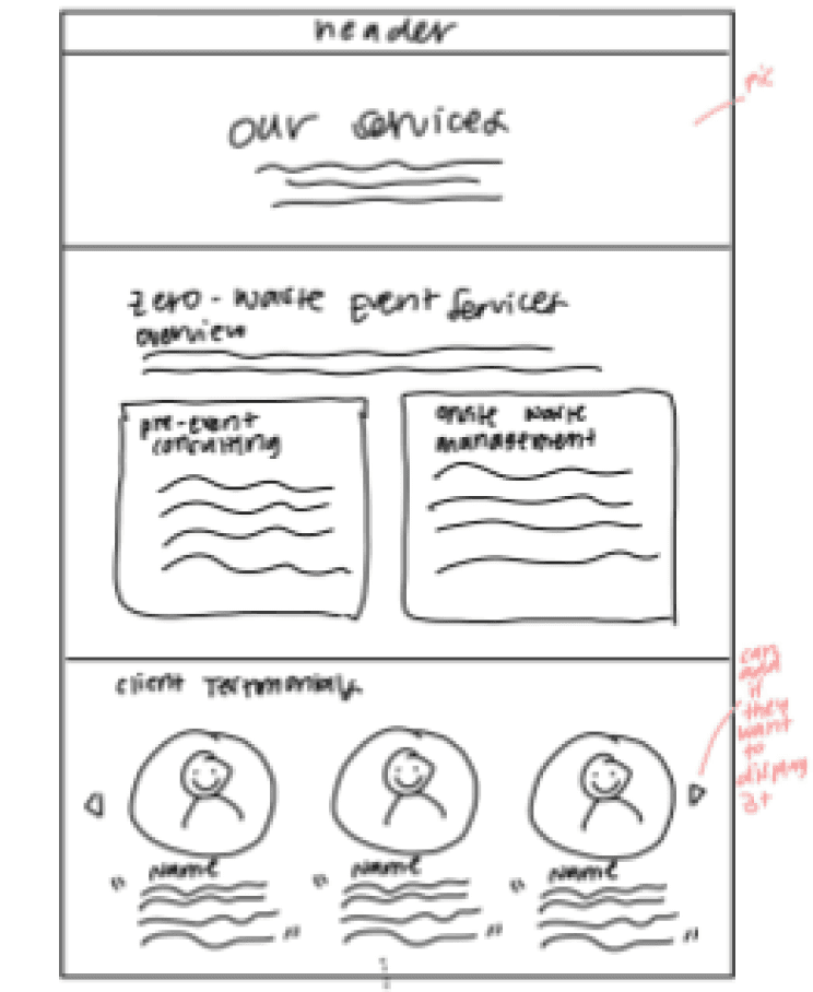
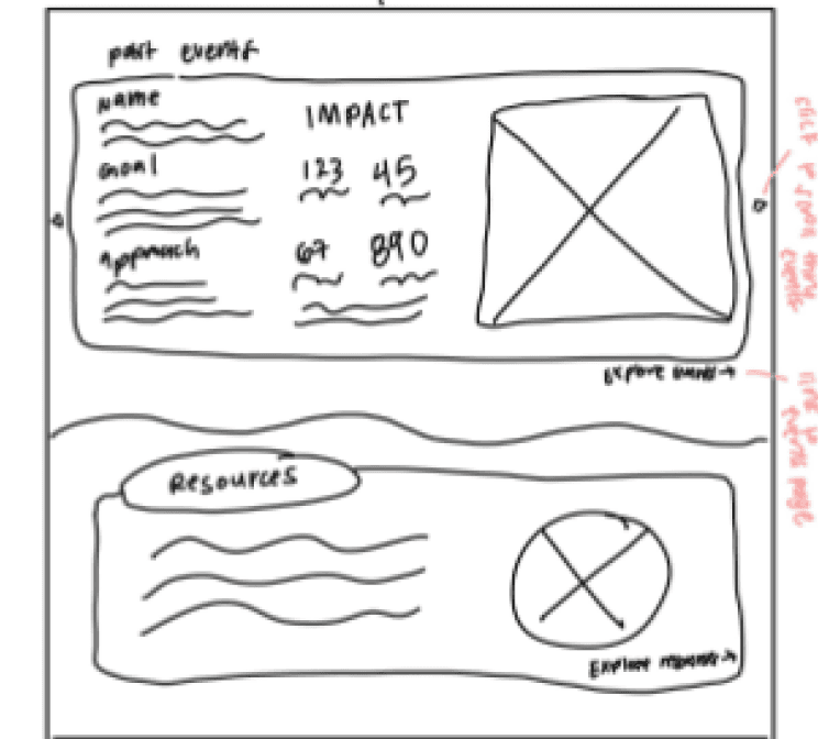


Additional sketches
thanks for stopping by!